
Translation Services‐DeepL Translator
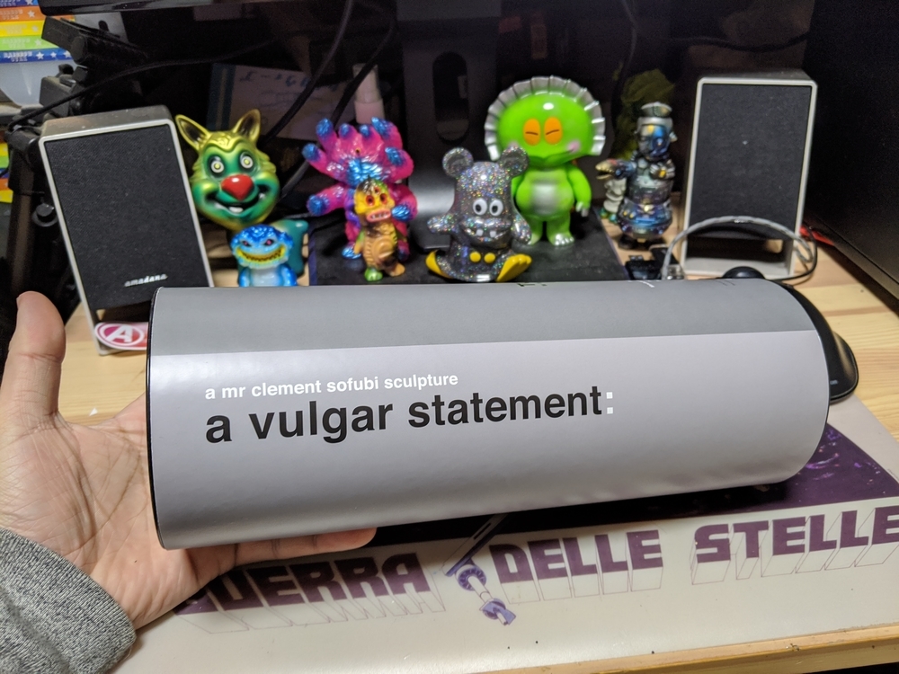
香港出身のアーティスト、ミスタークレメントさんの留之助商店プロデュースによる初のソフビ作品です。東京コミコン2019にて初売り、ついで音盤大學2019でも少数販売され、こちらで購入しました。
This is the first soft vinyl work produced by a Hong Kong artist, Mr. Clement Tomenosuke Shoten. It was sold for the first time at Tokyo Comic-Con 2019, and a small number of copies were also sold at Otoban Daigaku 2019, and I bought it here.

a vulgar statement=品のない声明(拙訳……vulgarには下品、低俗、粗野な、卑猥な、などの意味がある)と題された作品です。
追記:留之助さんのサイトではお下品な声明と訳されていました。下品な声明とするか自分は悩んだんですけど、なんか批判的に聞こえるし、もう少しニュアンスが違うなぁと思って品のないにしたんですけど、お下品とは! ばっちりな感じ!
バージョン名のwgbとは、今回発売された成型色ホワイト、グレー、ブラックの頭文字と思われます。
プロジェクト始動は、留之助商店さんのブログによりますと、2018年の6月とあります。
参照‐ミスター・クレメント初のソフビ計画、始動 : 下呂温泉 留之助商店 店主のブログ
ミスター・クレメントさんの普段の気性や、作風に見られない大胆なモチーフのスケッチが留之助商店店主の目に止まり、ソフビ化を打診され、作家自身による原型製作に着手。プロトタイプをミロクトイさんによる監修によって、スラッシュ成形ならではのノウハウがここで伝授され修正作業、そして完成となります。
全高約27センチ、4パーツ構成。成型色はグレー。シリアルナンバー入りで、50個とありますが、割り切れないので各色50個だと思われます。
The "wgb" in the version name seems to be the initials of the molded white, gray, and black colors released this time.
According to Tomenosuke Shoten's blog, the project started in June of 2018.
Reference - Mr. Clement's first soft vinyl project, starting : Gero Onsen, Renosuke Shoten's Blog
Mr. Clement's normal temperament and bold sketches of motifs not seen in the style of his work caught the eye of the owner of the Tomenosuke Store, and he was approached to make a soft vinyl version of the figure, and the artist himself began making the original. The prototype is supervised by Mr. Miroquois, and the know-how of slash molding is transmitted here, corrected, and completed.
Height approximately 27 cm, 4 parts composition. The molding color is gray. It's numbered, and it says 50 pieces, but I think it's 50 pieces in each color because it's hard to divide.

まずはアンボックス。
立派な紙管ケースに入っています。
First, the unboxing.
It comes in a respectable paper tube case.
作品名。
Title of work.
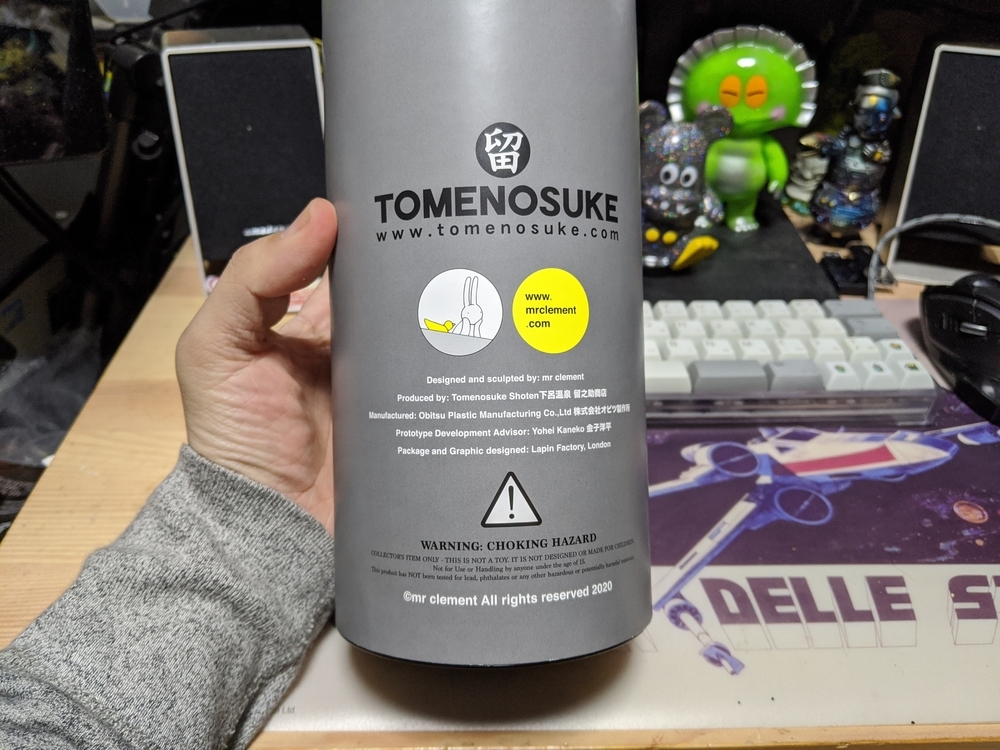

デザインと原型をミスター・クレメント。プロデュースを留之助商店。ソフビ制作はオビツ製作所。アドバイザーとして金子洋平(ミロクトイ)。パッケージデザインはミスタークレメントさんがロンドン王立美術院に在籍中に設立した会社ラパン・ファクトリー。そうそうたる顔ぶれ。
Design and prototype by Mr. Clement. Produced by Tomenosuke Shoten. The soft vinyl production is done by Obitsu Manufacturing. Yohei Kaneko (Mirocktoy) as an advisor. The packaging was designed by the Lapin Factory, a company Mr. Clement founded while he was a student at the Royal College of Art in London. There are so many faces.
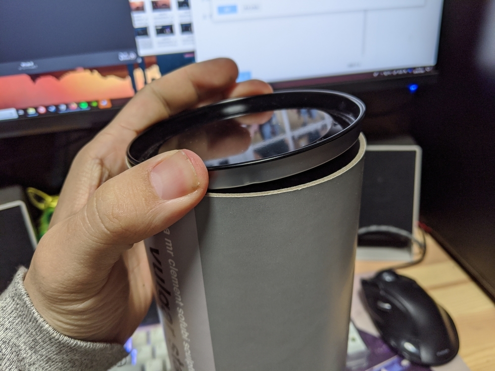
上下は金属の蓋がされています。
The top and bottom are covered with a metal lid.

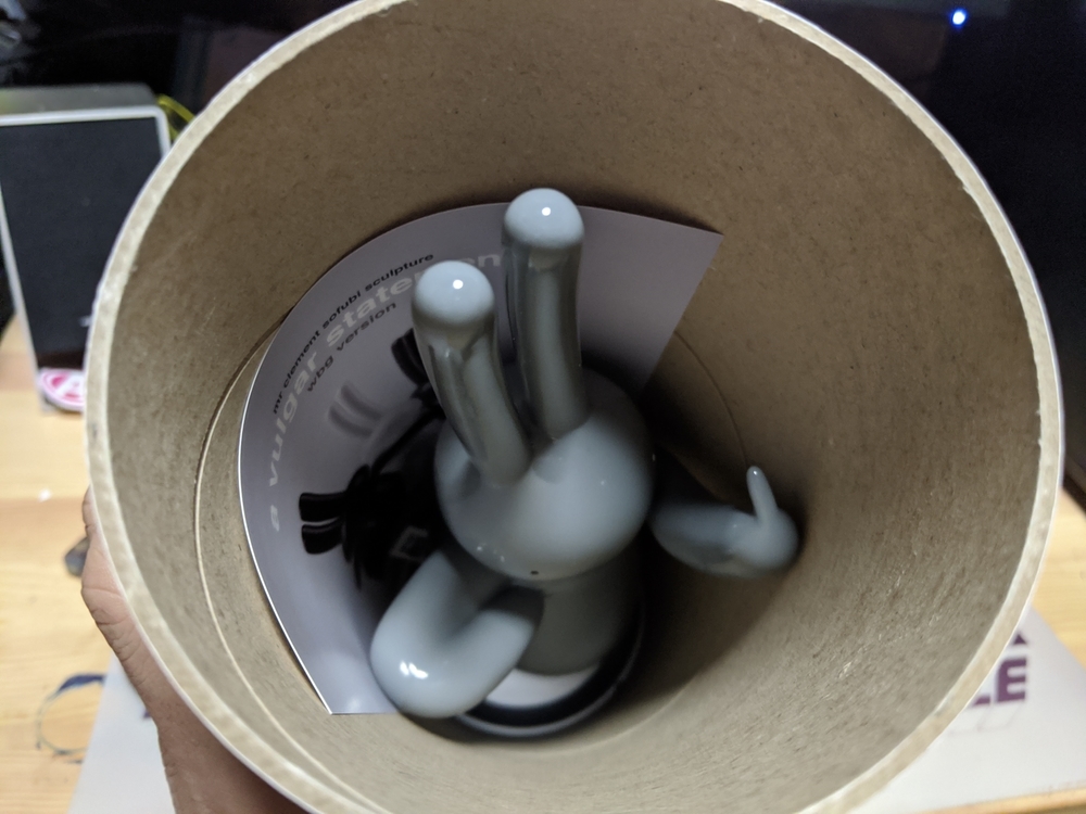
こんな風に袋詰されていますが……。
袋を外して戻すと、こんな風になります。
They are bagged like this.........
When you remove the bag and put it back, it looks like this.
FXXX YOU!
やばい、このウサギ、最初から喧嘩売ってますよ(笑)。これ、腕を下げるとケースに収まりません。ギリギリのサイズにしてパッケージデザインしてあるところからも、メッセージ性感じちゃうなぁ。
FXXX YOU!
Oh my gosh, this rabbit is fighting from the beginning (laughs). This does not fit in the case when the arm is lowered. The packaging is designed to be just the right size, and I can feel the message.

フライヤー入り。
どの色も素敵ですが、自分がグレーに選んだ理由もちゃんとあります。
With a flyer.
All the colours are lovely, but there's a good reason why I chose the grey.

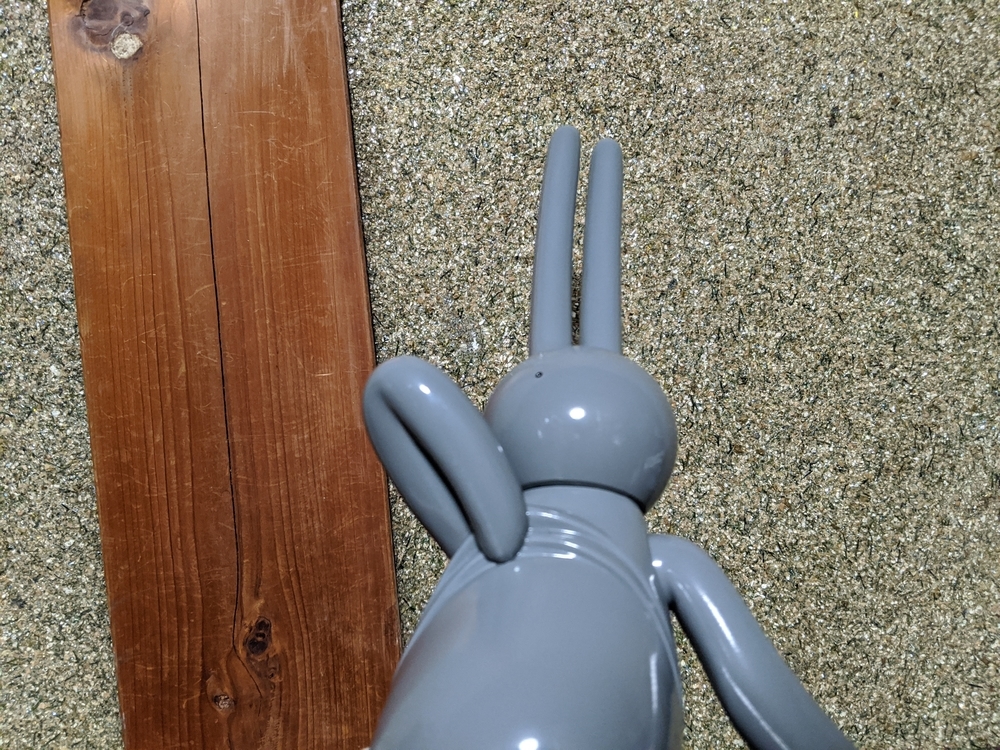
ここから本体紹介。
可愛らしいウサギが……。
The main body is introduced here.
The adorable bunny.........
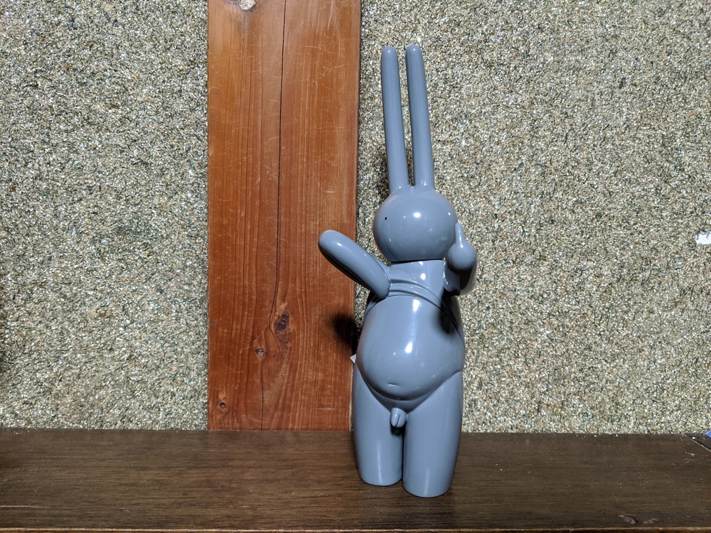
どーんと局部丸出しで、FXXX YOU! しています。
It's a great way to get the most out of your local area and make a FXXX YOU!
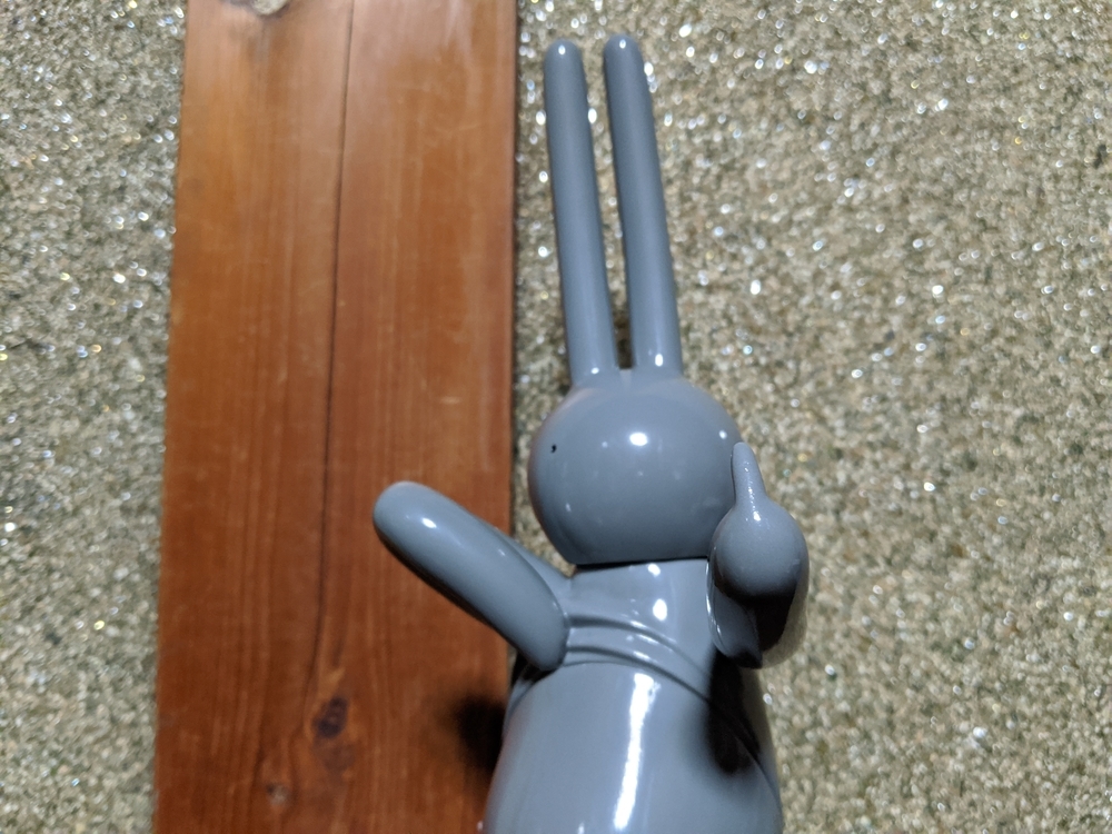
まずは、この艷やかな美しい造形に魅せされます。
磨き込まれた原型ならではの仕上がり。
頭部がピカピカすぎてキモいオッサン写り込んでいないか、心配。
The first thing to do is to be fascinated by this bewitchingly beautiful shape.
Unique finish of the original type that has been polished.
I'm worried about whether the head is too shiny and the creepy guy is in the picture.

留之助商店さんのブログにも書いてあるんですけど、おちんちんモチーフや丸出しのおもちゃって、売れ行き良くないそうなんです。自分はそれちょっと分かるなぁって思うんです。恥部と書くように、そこは本来秘される部分なんですよ、きっと。この作品では、まずウサギというモチーフも造形も可愛げがあります。
It's written on Tomenosuke Shoten's blog that toys with an onchin motif or a round shape don't sell well. I think I understand that. As I wrote, it's a part of the body that is naturally hidden. In this work, the motif of the rabbit and the form are cute.

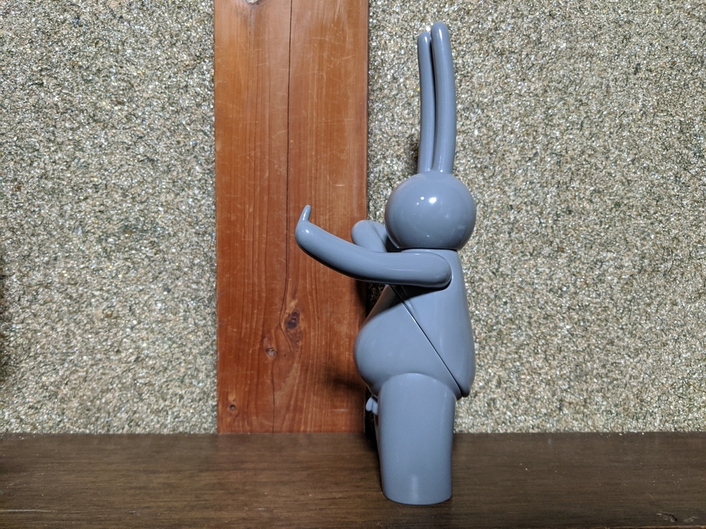
ピヨーンとバルンアートの風船のように長く伸びた耳、ぽっこりと突き出た腹、象のように太い脚……どの部位もめちゃくちゃキュートです。局部丸出し、中指突き立てポーズにイヤラシさがない。そして服の裾をたくし上げてさらけ出しているポーズ。ここにメッセージ性が込められていると思います。このウサギ、おちんちんまるだしおもちゃの革命児になるんじゃないかな……。
Long ears that extend like balloons of peyone and balloon art, a chubby belly that juts out, legs as thick as an elephant's... Every part of it is very cute. There is no annoyance in the pose of the middle finger sticking out of the part. And the pose where the hem of the clothes is pulled up and exposed. I think there's a message here. I think this rabbit will become a toy revolutionary with its full penis.....

「お下品な声明」というタイトルにあるとおり、彼は自分をさらけ出して、なにかに抗議をしているように見えます。自分には教養も品位もないが、何か大きなものと戦っているように見えるのです。世の中には常識とか理想論とかで、そうあるべきことというのはあるけれど、そう簡単に割り切れるモノなんてありません。今回グレー成形を選んだのは、白とも黒とも判断つかないグレーと言う色が、作品のメッセージ性と合っている気がしたからでした。うーん、でも改めて考えると、白黒つけると言う言葉もあるし、何色でも良いなぁ……、そう考えると、賛成、反対、保留と3カラーにしたのは考えられていますね。灰色にしたのは自分の優柔不断さ故か……(笑)。
As the title says, "vulgar statement," he seems to be exposing himself and protesting something. I don't see myself as educated or dignified, but I see myself as fighting something big. In the world, there are things that are supposed to be like that, like common sense and idealism, but nothing is so easy to divide. The reason I chose gray molding this time was because I felt that the color gray, which is neither white nor black, matched the message of the work. Hmm, but when I think about it again, there is a word to say that I'm going to apply black and white, and any color is good..., and when I think about it, it's considered that I made it three colors with approval, opposition, and holding. Maybe it was my own indecision that made it gray...(laughs).
それと、グレー成形だけ目がオッドアイなんですよね。オッドアイと全身黒色と名前をダガー(†)で飾るのは、中二病の証。ま、自分はどれもやったことないけど……。
瞳は黒成形は白、白成形は黒になっています。この作品の塗装箇所は目だけです。非常にシンプルかつ美しい。
Also, only the gray molding has an odd eye. Odd-eyed, all-black, and a dagger (†) to adorn his name is a sign of middle-agedness. Well, I've never done any of them myself.....
The eyes are white for black molding and black for white molding. The only painted areas on this piece are the eyes. Very simple and beautiful.

パーツ分けに関しても注目すべき点があり、首は斜めに傾いて取り付けられています。微妙なニュアンスがかわいいです。
The parting is also notable: the neck is attached at an angle. The subtle nuances are cute.
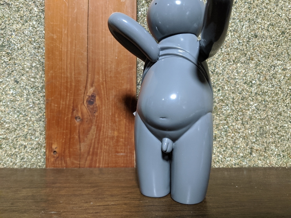
自堕落なお腹。これのどこが悪い、どこが恥ずかしいのか! 潰れたヘソも可愛い。全体的に幾何学的なシェイプのこの作品の中で、この部分が妙に生々しい。
A self-indulgent belly. What's wrong with this and what's embarrassing about it! The mashed-up navel is also cute. The overall geometric shape of this piece is strangely raw in this part of the piece.

シャツをたくし上げている部分で分割され自然です。
右腕は分割せずにボディとひとつづき。
成形時、抜きやすい形状です。計算されています。
It is natural to be split at the part where the shirt is tucked up.
The right arm is undivided and united with the body.
The shape is easy to remove during molding. It has been calculated.
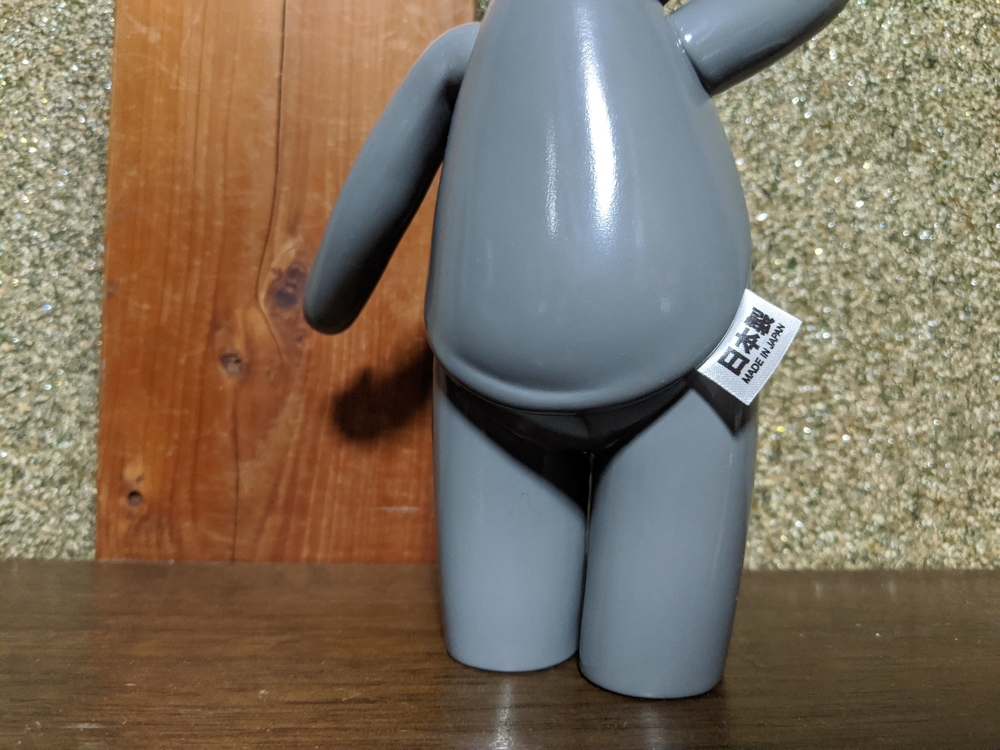
シャツの裾からタグが出ています。
これも面白い。こんなことしているソフビを知らないので、発明だと思います。浅学で申し訳ないのですが、あれば教えてください。
The tag is sticking out from the hem of the shirt.
This is also interesting. I don't know of any sofubi doing this, so I think it's an invention. I apologize for my shallow learning, but if you have any, please let me know.
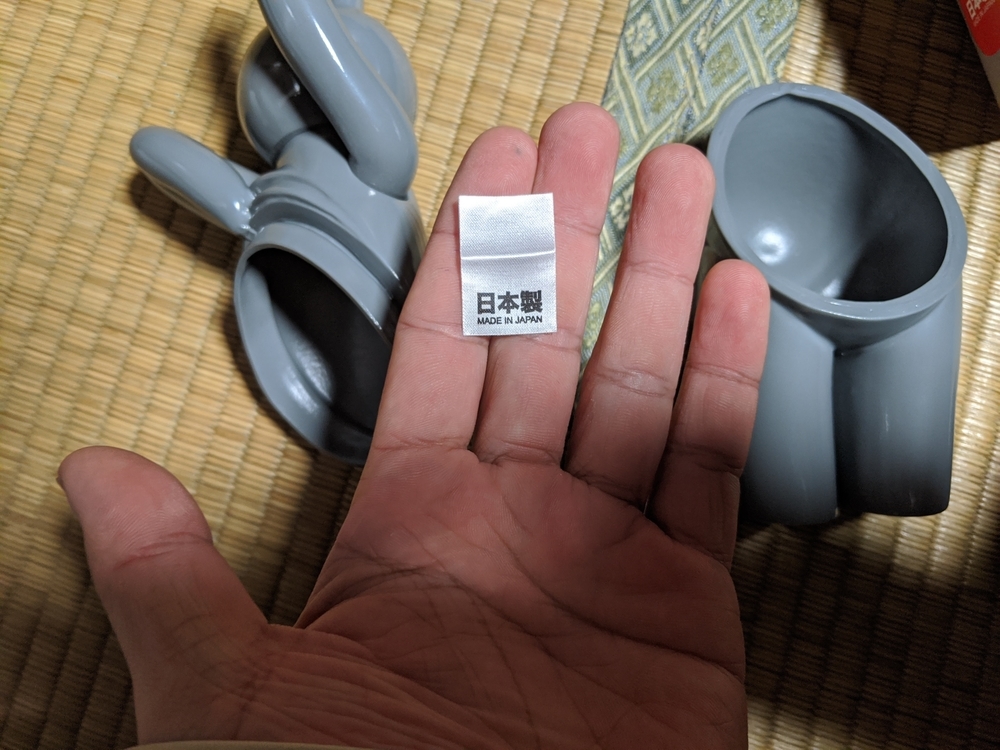
衣服の製品タグが、分割のところで挟まれているんです。
同じ色の成型色で同じテクスチャなのに、素材の違いを明瞭に表しています!
このアイディアには敬服しました。
The product tag on the garment is wedged in at the division.
It's the same molding color and the same texture, but it clearly shows the difference in material!
I admire this idea.

足の裏にタンポ印刷で、名入れしてあります。
The name is imprinted on the sole of the foot by tampo printing.
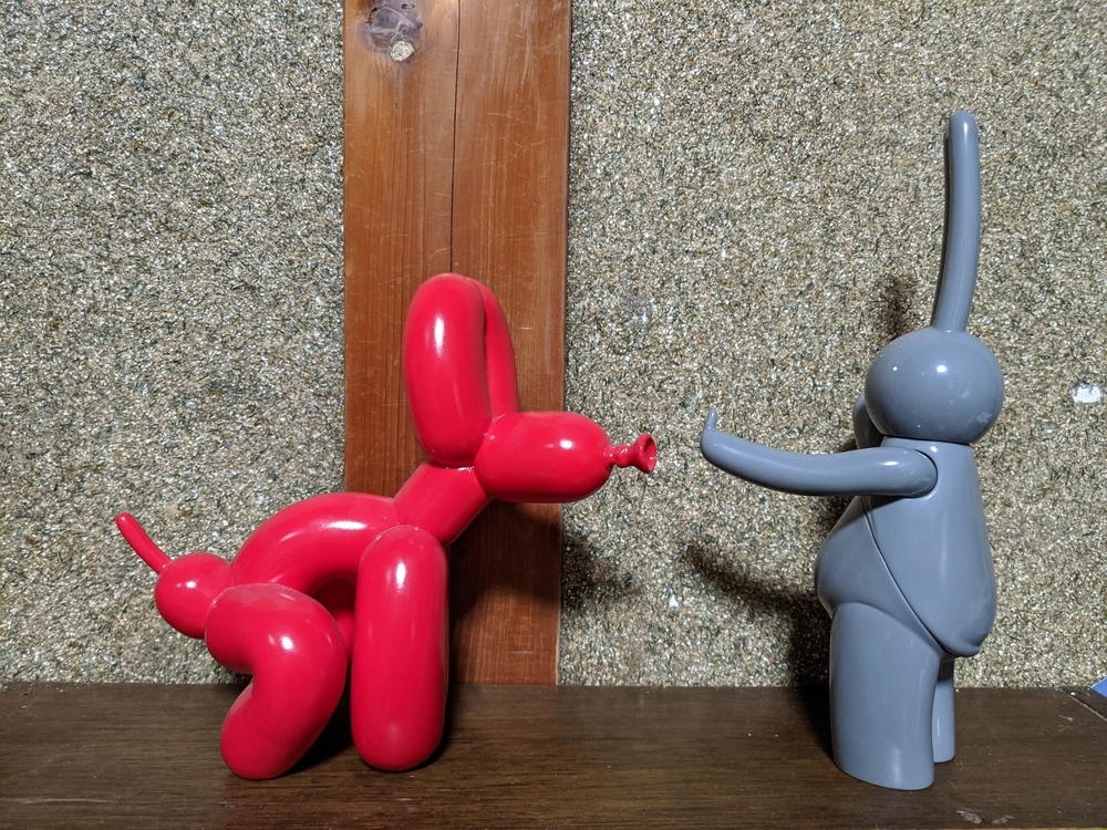
なんとなく見た目で並べてみました。
Side by side with the only Mr. Clement work I have.
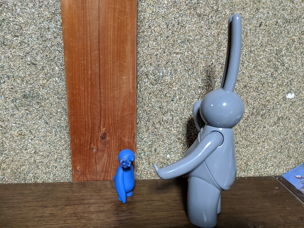
僕が唯一持っているミスター・クレメント作品と並べて。
Side by side with the only Mr. Clement work I have.
塗装版も予定されているそうですが、シンプルな造形なので、どういう塗装が施されるのか、ちょっと想像付きません。さらけ出したお腹にボディペイント風に風刺の効いたワードをペイントしても良いかもしれません。例えば……うーむ、なんだろう。「NO WAR」なんかは単純すぎるかな……。ターゲットマークは違うアーティストのモチーフだし……。
A painted version is also planned, but since it's a simple model, it's hard to imagine what kind of paint will be applied to it. You might as well paint a satirical word like body paint on your exposed belly. For example....hmmm, I don't know. I guess "NO WAR" is too simple..... The target mark is a motif of a different artist.....